.png)
PLUS is a tutoring platform that connects human tutors with AI-driven software to boost learning gains for middle school students from historically underserved communities. The platform currently supports over 13 schools, 3000 students, 500 tutors, completing more than 10k hours of tutoring every month.
As the Product & Design Systems Designer, I built an AI-powered prototyping agent using Figma tokens to generate system-aligned UI, enabling faster validation across design, product, and engineering. I led the scaling of the design system by standardizing tokens and component sizing, and by migrating legacy work into a unified Web App Specs file to improve consistency and developer handoff.
Design and prototyping work at PLUS involves repeated context re-entry and tool-switching as ideas evolve from low to higher fidelity. Designers often redo setup work, re-explain system constraints, and reconstruct context when moving between tools or collaborators.
At the same time, PMs and developers lack a fast, reliable way to visualize ideas early. Existing tools either require deep design knowledge or produce outputs that are inconsistent and difficult to evaluate.
PLUS UNO is an AI-powered prototyping tool built on top of a Cursor agent, pre-trained with PLUS design system tokens, layout logic, and component documentation. The goal is to enable designers to generate realistic, system-aligned prototypes quickly, while allowing PMs and developers to evaluate ideas earlier and more concretely—without requiring them to learn design tools.
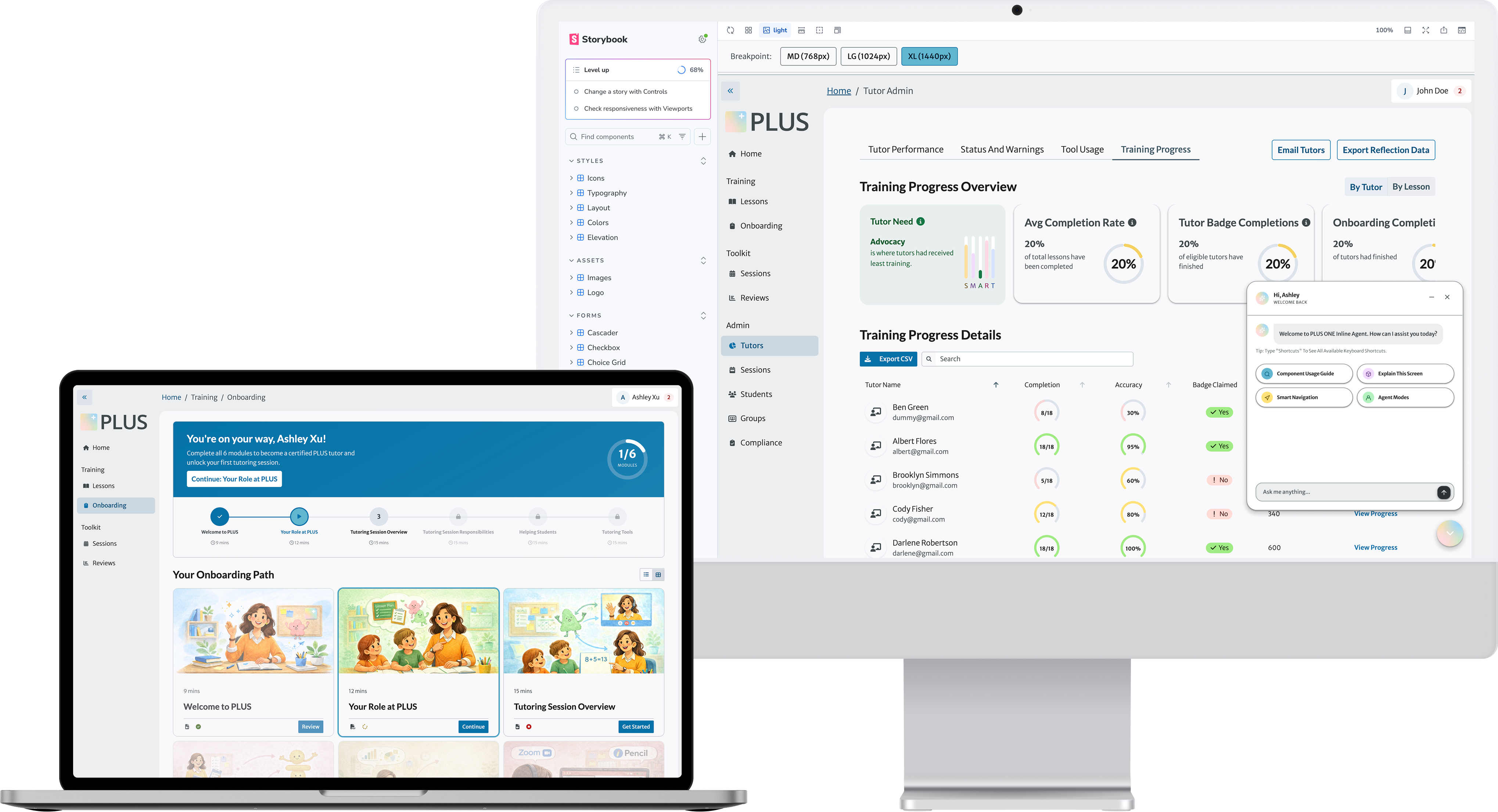
To bring AI guidance directly to where designers work, I integrated a live LLM backend into Storybook. By embedding the AI directly into our component library, designers and developers can pull up usage guidelines, get technical breakdowns of the specific screen they are viewing, and navigate the design system using natural language.
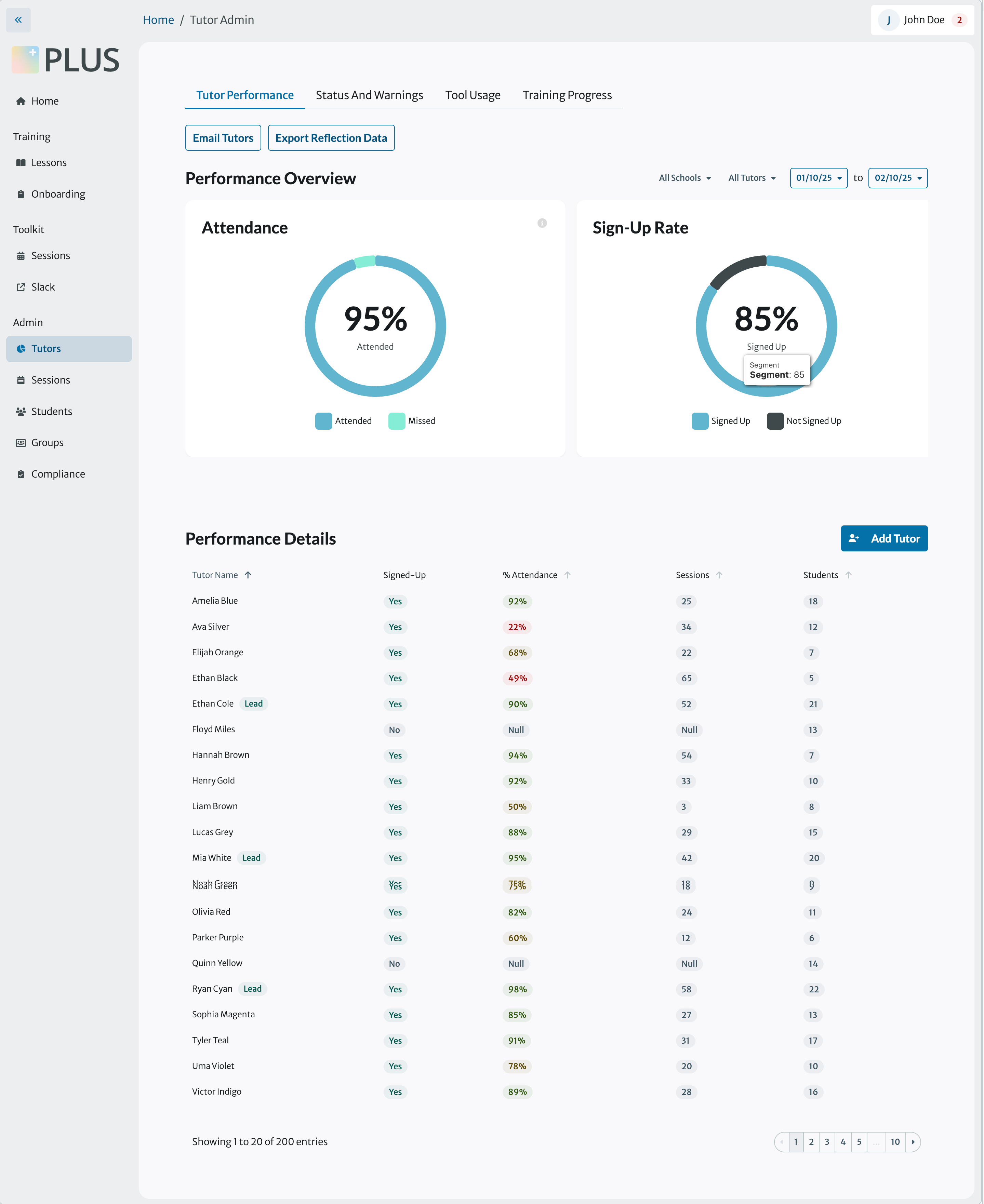
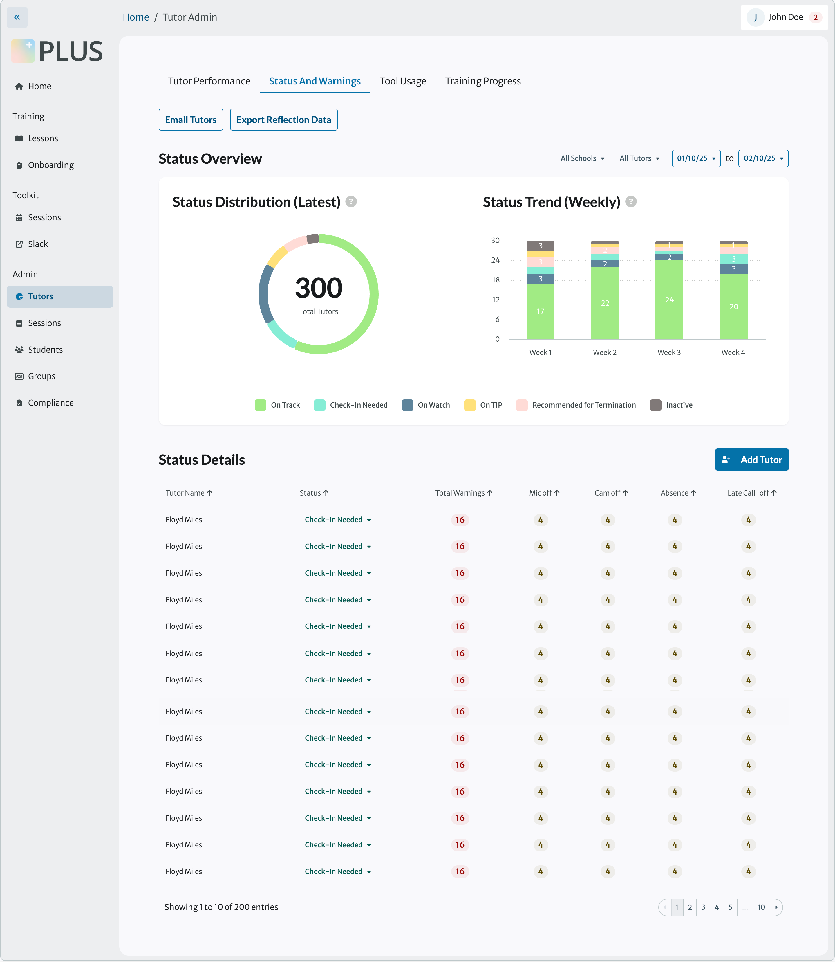
I used PLUS UNO to prototype a tutor onboarding redesign across 3 fidelity modes: Consulting, Iteration, and Prototyping. The goal was to move from structure to interactive prototype entirely within the PLUS design system — no manual component setup, no context re-entry between stages.
To ensure the AI had deep system-level knowledge, I translated our visual specs for the Profile, Training, and Admin flows directly into the PLUS UNO’s codebase. When the AI generates complex prototypes, it references these exact structural constraints rather than guessing, ensuring perfect alignment with our design standards.
Before introducing the AI prototyping workflow, I focused on strengthening the foundations of our design system to ensure the agent could produce reliable, system-aligned outputs.
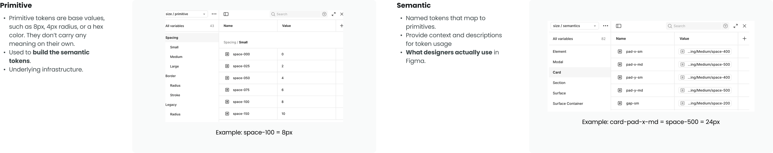
The design system was mid-migration after a handoff, leaving spacing and color usage inconsistent and dependent on legacy tokens. I finalized and scaled a semantic spacing and color token system—owning definitions for cards, sections, surfaces, and containers—and applied it across all atomic and molecular components. This created a scalable, machine-readable foundation that enabled AI to generate system-compliant, high-fidelity prototypes by default.

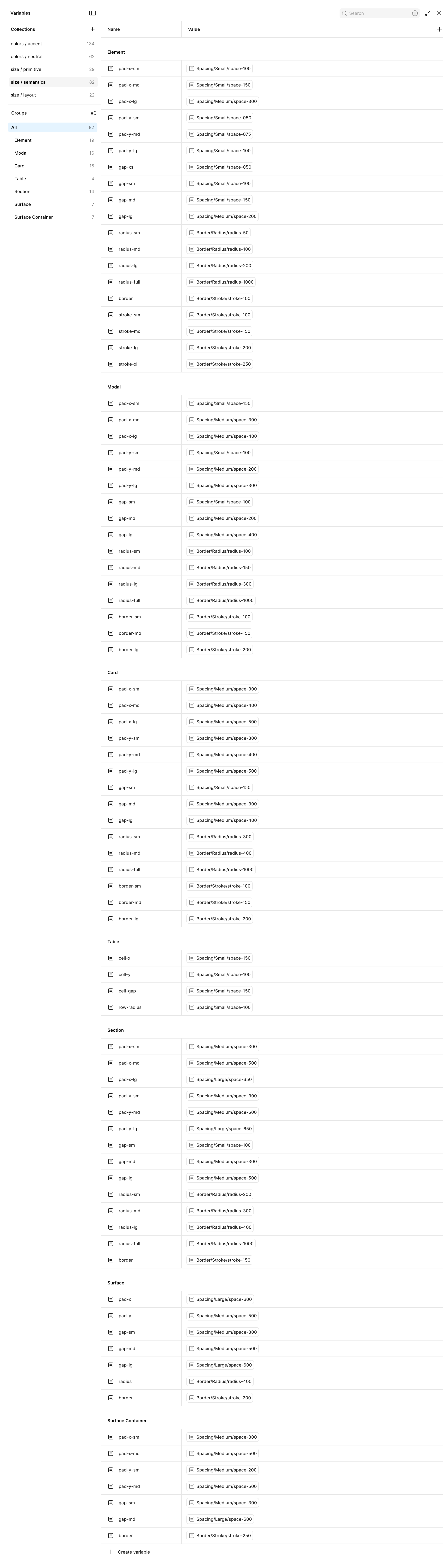
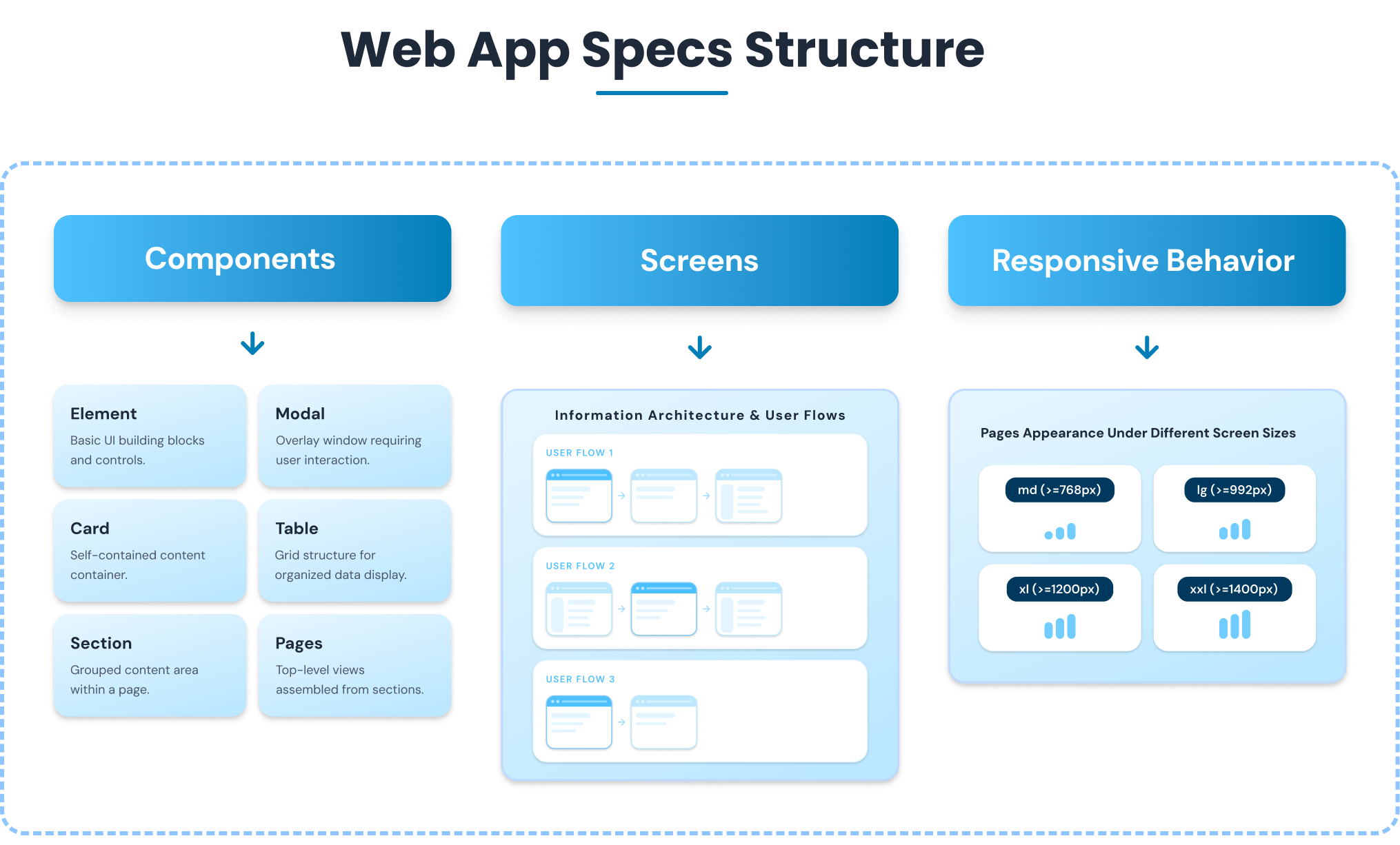
Design specs were scattered across multiple folders with inconsistent documentation and legacy token usage, slowing collaboration and handoffs. I audited and consolidated these files into a unified Web App Specs project, ensuring all documentation reflected the latest system tokens and standards.
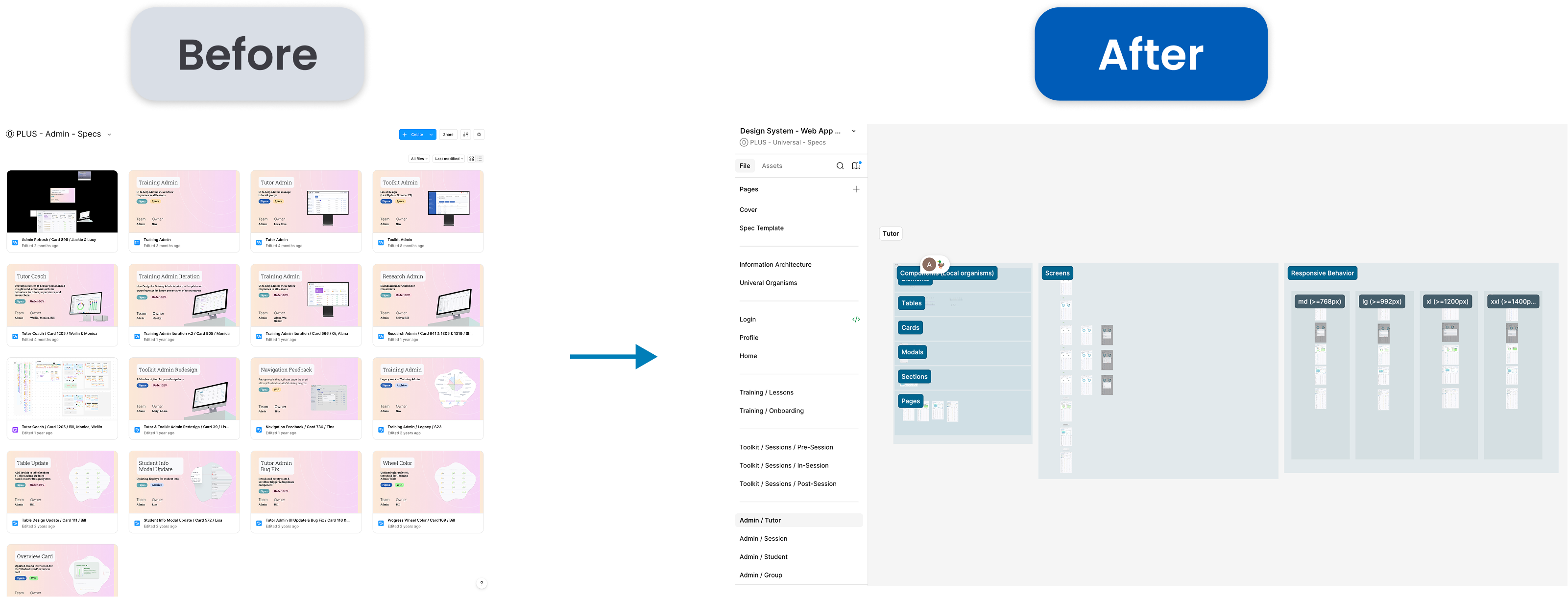
I owned end-to-end specifications for the Profile, Training, and Admin specs and aligned spacing and color tokens across molecular and organism-level components, establishing a standardized framework that improved spec clarity and streamlined future design handoffs. This clean, standardized framework ultimately served as the exact 'source of truth' programmed into the PLUS UNO agent, enabling the AI to reliably generate consistent, system-aligned layouts."
Existing prototyping tools require designers to constantly re-explain system constraints every time they start a new project. To solve this, we designed a pre-configured Starting Kit for our AI coding agent. By providing the agent with our UI components and guidelines by default, it operates with persistent, system-level context.
While Figma houses our static designs, AI-generated code needs a reliable reference point. We positioned Storybook as the canonical source for components and layouts, serving as the living library. This ensures the AI pulls from executable code components that perfectly reflect the actual product UI, and allows designers to visually test outputs in isolation.
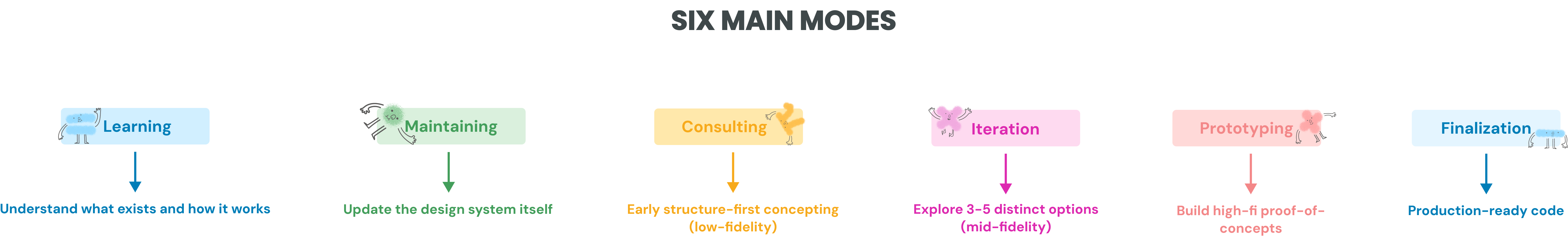
Open-ended AI can be paralyzing. To give users clear action paths and ensure the AI gave stage-appropriate outputs, we broke the prototyping journey down into 6 functional modes:
Cursor Agent (Claude Sonnet, in IDE)
In‑App AI Server (GPT‑4o‑mini, runtime)

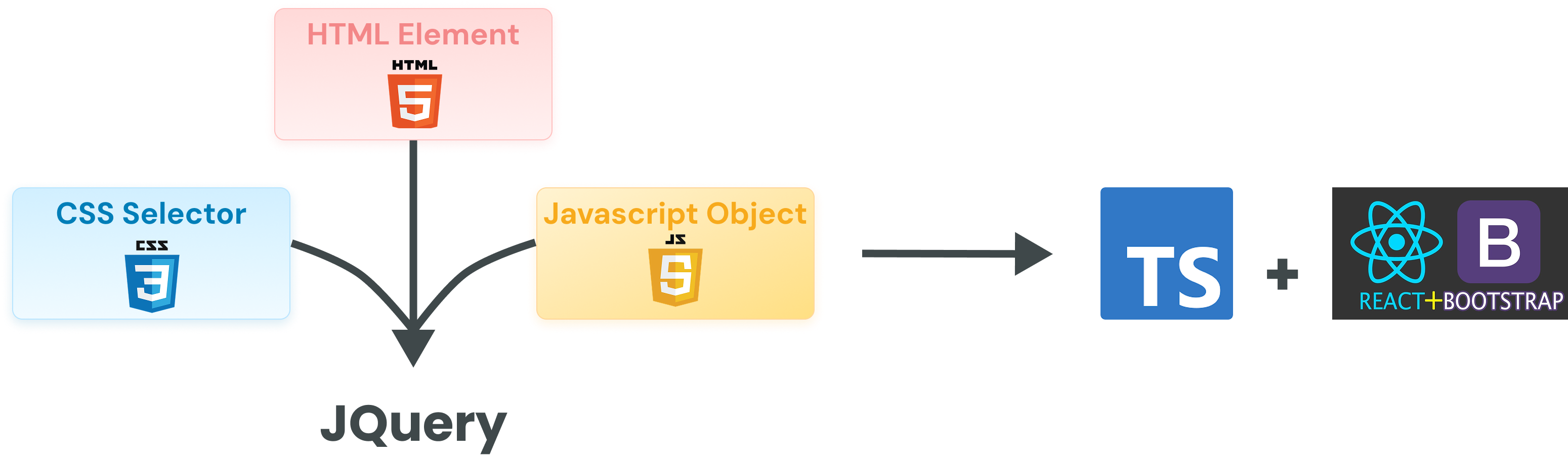
Our initial goal was to generate production-ready code directly from prototypes, but after multiple iterations and dev team reviews, the AI-generated code—especially using a legacy HTML/CSS/jQuery-based stack—was not usable. The coding agent struggled with legacy patterns, and the generated code was difficult to validate, review, and maintain.
To move faster and stay aligned with real design workflows, we pivoted.
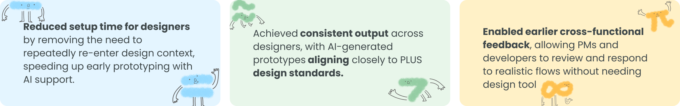
Outcome
Modernizing our UI foundation removed the friction of legacy tech debt, empowering the AI to generate clean code so we could focus entirely on design speed and impact.
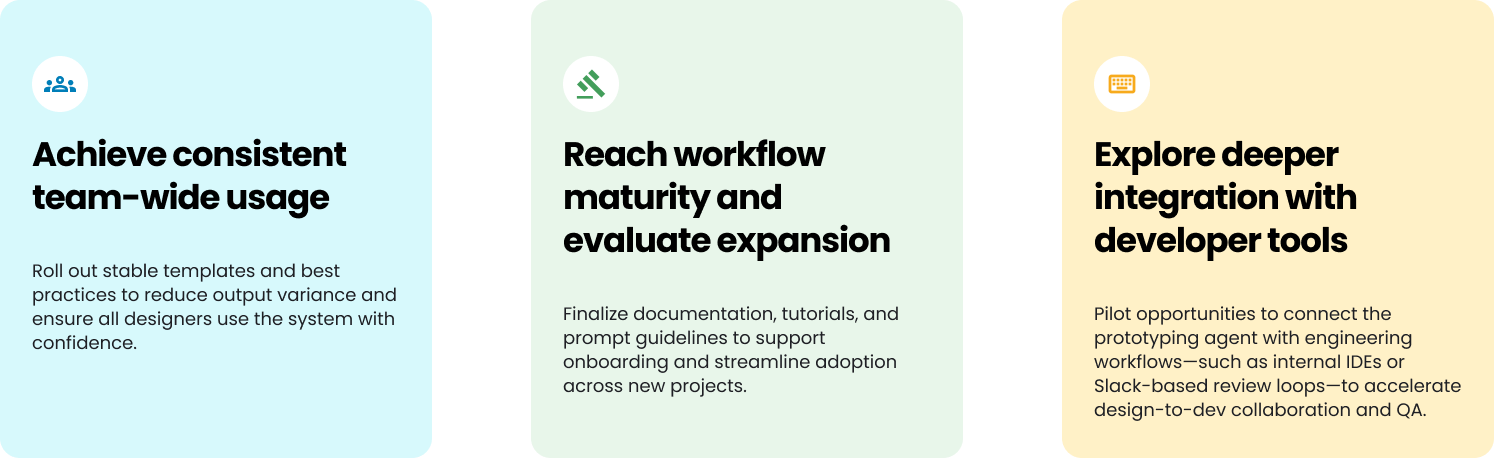
As PLUS UNO stabilizes, our focus shifts toward maturity and expansion. We aim to solidify the agent’s place in the design process and explore new opportunities for impact.
NPM provides a portable way to define and share components, guidelines, and context across tools and environments, reducing lock-in and repeated setup.
Designers are the primary users. PMs and developers benefit by being able to evaluate ideas earlier using realistic artifacts.
Rather than being tool-specific, this approach emphasizes persistent system-level context that carries across tools and fidelity levels.
Storybook is an interactive component library and living documentation tool for the PLUS Design System. It lets designers and developers browse, test, and adjust real coded components in isolation, making it easier to ensure alignment with Figma designs. Unlike Figma, which contains static design files, Storybook hosts executable code components that reflect the actual product UI.
Although the components already exist in production, the codebase is written in a legacy format that’s difficult for AI coding agents to read, interpret, and reuse. To enable more reliable AI-assisted prototyping, we intentionally adopted a modern stack—TypeScript, React, and React Bootstrap—which provides cleaner structure, better modularity, and significantly improved compatibility with coding agents.