Grace Gresli,
Sabrina Lee
Project Background
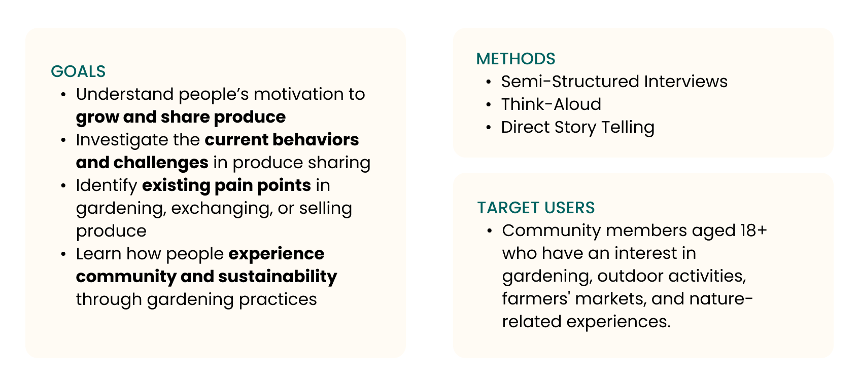
Produce sharing in local communities today is often inefficient and fragmented. Existing solutions lack a strong sense of community, fail to optimize surplus resources, and fall short in promoting sustainable practices. Producia is designed to fill this gap by connecting community members aged 18+ who are interested in gardening, outdoor activities, farmers’ markets, and nature-based experiences. The platform empowers neighbors to exchange, discover, and share fresh produce in a way that is social, sustainable, and resource-efficient.
I worked as the UX Designer and UX Researcher for this project. I conducted user interviews and generated research insights that guided the design decisions. I led the design process from ideation to the final prototype and designed key features, including the Harvest Map, Swap & Trade, and Search Item flows.
Solution Overview
Process
.jpg)
Research
Initial Research
We began with some exploratory qualitative research into this problem space. We wanted to understand about people's experiences with sharing, buying and selling produce.

Competitive Analysis
After completing the competitor analysis, we found that existing solutions leave key gaps that Producia can uniquely address:
- None of the products provide a true Swap & Barter Exchange System with a structured trade proposal and negotiation flow — existing platforms are limited to donation models (Olio, Fresh Food Connect) or simple buy/sell transactions (Farmish).
- Although current products offer maps or listings, none deliver an Interactive Harvest Map with Local Discovery that showcases real-time availability, freshness, and seasonal context.
Affinity Diagram
We interviewed participants and captured detailed notes about their experiences with gardening, produce sharing, and sustainability. Using affinity diagramming, we:
- Transferred our notes onto digital sticky notes
- Grouped similar insights together
- Identified emerging themes and user priorities
Insights
After reviewing our affinity diagram, we identified several key insights that capture the major findings and themes emerging from our analysis.
.png)
Synthesis & Ideation
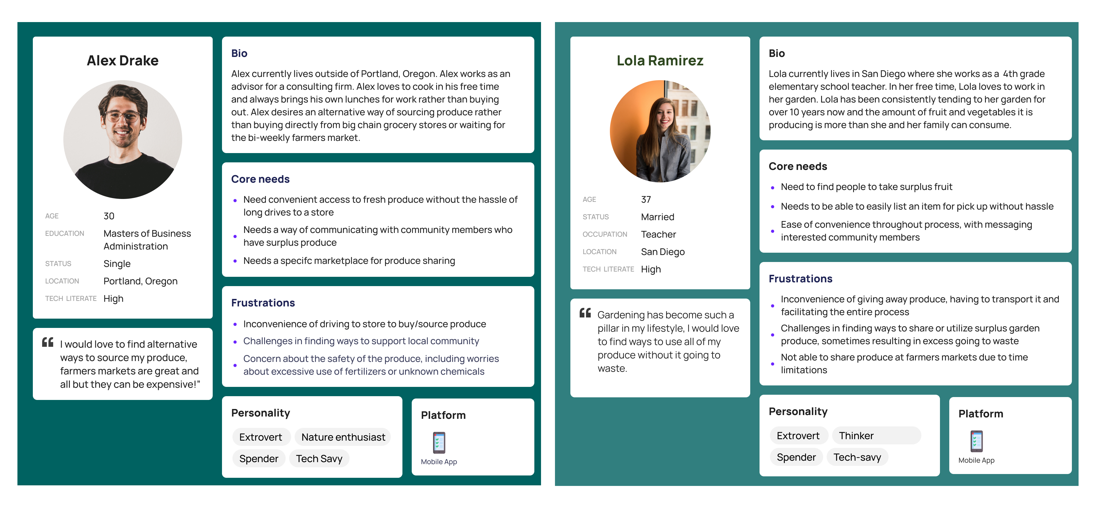
Persona

User Flows
In order to gain a more comprehensive understanding of our users' experience, we created user flow diagrams. These diagrams visually outline the step-by-step journey users take when interacting with our product, focusing on four key areas.
Low-Fi Prototypes
Wireframe Sketches
After we decided the main flow and overall structure, we divided the experience into four major sections based on the user flows. Below are the wireframes I created for the "Searching Item + Message Seller" and "Add Listing Flow".
.jpeg)
.jpeg)
The main stages of this application can be translated into these following features.
.png)
Paper Prototypes
We then created paper prototypes based on our wireframe sketches and user flows to simulate the on-screen interactions. The prototypes then are used for think aloud user testing. This allowed us to rapidly iterate, and gather early user feedback. Below are the paper prototypes for the application.
-compressed.jpg)
Think Aloud Testing
During testing sessions, we presented the paper prototype flows to participants and asked them to “think aloud” as they interacted with each screen. We wanted to understand these main questions:
- Whether the overall flow makes sense
- Out of the current flows, whether users could easily identify the core actions
- What features users prefer and where we can innovate or pivot
We compiled and analyze our interview notes and found the following insights:

Mid-Fi Prototypes
Reframing the Scope
After reviewing the feedback from user testing, we decided to narrow our project scope to better focus on the Harvest Map, Swap & Trade, and Listing flows. These stages seemed to engage users the most and directly addressed the needs we identified earlier — connection, transparency, and a sense of community through sharing local produce.
.png)
.png)
Vidual Style Guide
Before diving into the mid-fidelity prototype, we developed a design style guide to ensure consistency and clarity across the interface. We focused on creating a clean, approachable visual style that reflects community connection and sustainability. We decided to use calming green tones to convey freshness, and a sense of environmental connection. In addition to the color palette and typography, we also defined key components — like buttons, navigation icons, and badges — to to keep the interface cohesive and easy to navigate.
Mid-Fi Screens
1. Searching Item
Users can search for produce by entering a keyword in the search bar. If the item is not available, a pop-up window notifies them that the item is currently unavailable. In addition to search, users can browse items directly from the home page and view detailed information. From the item detail page, they can select a desired quantity, message the seller for more information, and tap Reserve to confirm their selection.
.png)
2. Message Seller
Users can message the seller directly from the item detail page or view all conversations through the “Messages” tab in the navigation bar.

3. Add items to your listing
Sellers can add new items by clicking the “Add Listing” tab in the navigation bar. They can upload images, enter details like title, description, quantity, pickup times, and location. After reviewing the information, they can submit the listing. Once confirmed, a success screen appears, letting them know their item has been successfully listed.
.png)
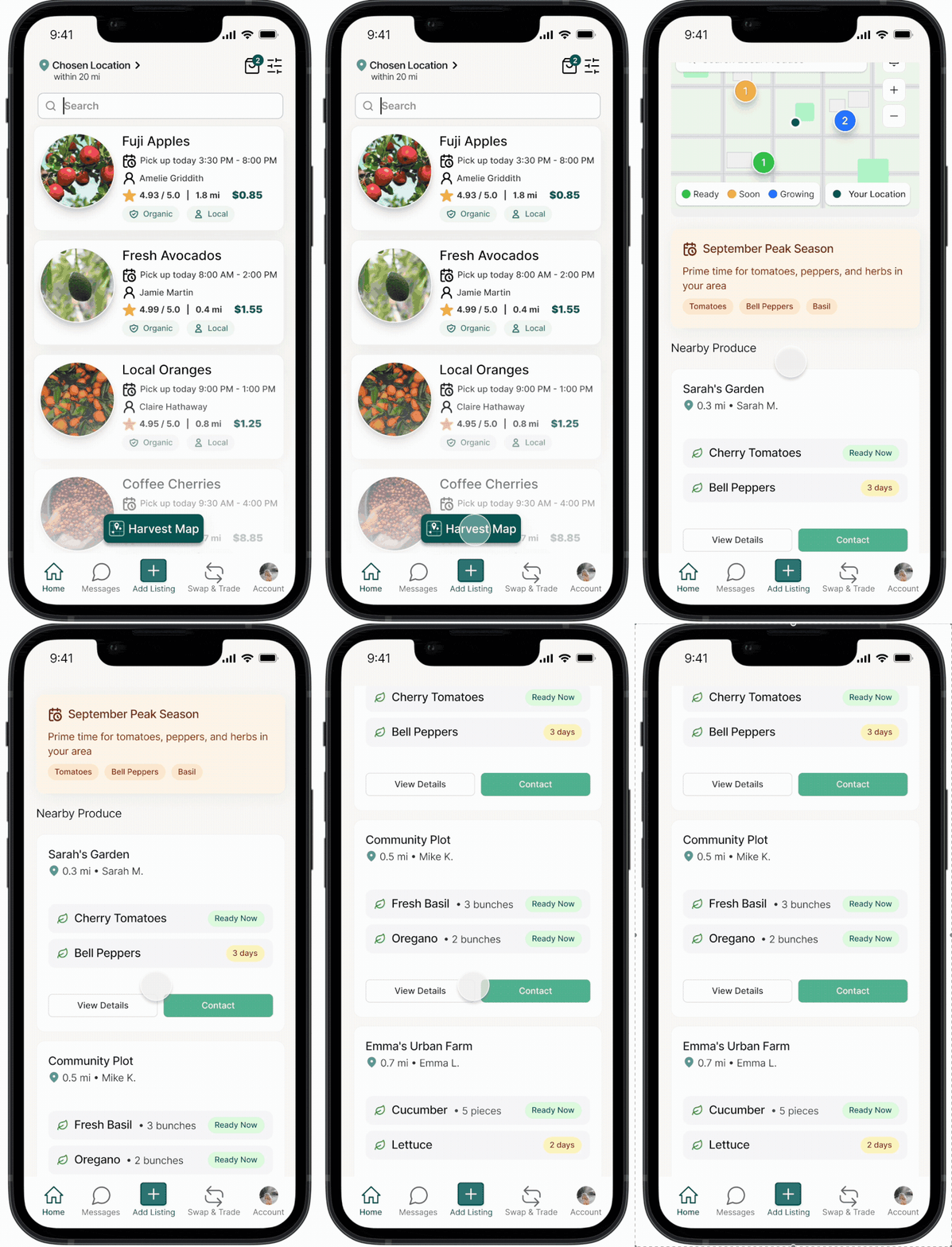
4. Harvest Map
The Harvest Map lets users instantly view what’s growing nearby, along with pickup windows and real-time availability. It helps users discover local produce, track freshness, and connect with nearby growers.
.png)
5. Swap & Trade
The Swap & Trade allows users to easily exchange their surplus produce without involving money. Users can browse nearby listings, select what they’d like to trade for, and propose an exchange directly. This feature promotes community connection and sustainability by encouraging bartering and reducing waste.
.png)
User testing Feedback
We tested our mid-fidelity prototype with people who are interested in gardening, local produce sharing, and sustainable living. Here are some of the main takeaways from the testing:
.png)
High-Fi Prototypes
Design Objectives
Our high-fidelity prototype represents the final iteration. We refined mid-fi screens based on user testing, enhancing engagement with a paper bag icon to track reserved and listing items, added motion and microinteractions, and improved overall visual consistency.
%20(1).gif)
Add Items to your Listing for sale
After adding their item, users can review the details and click View Listing to confirm everything looks right. They’re then directed to "My Listing", where all their active items are displayed in one place.

Harvest Map
The Harvest Map appears as a floating window on the home page, allowing users to instantly view nearby gardens and available produce within a few miles. It highlights real-time availability, pickup windows, and freshness, helping users discover what’s growing in their community at a glance.

Searching Item + Reserve Item + Message Seller
The reserve item feature allows users to search for produce, select the desired quantity, message the seller for more details, and tap Reserve to confirm. They can check all reserved items anytime by clicking the bag icon on the home page under “My Reserved.”
.gif)
Swap & Trade
The Swap & Trade feature allows users to exchange surplus produce directly with others in the community. Instead of buying or selling, users can propose and review trades, promoting sustainability and strengthening local connections.
Reflections
We started this project with a lot of ideas for what the platform could be, but through user testing and time constraints, we decided to narrow our focus to the features that stood out the most. This process taught us the importance of prioritizing what truly matters to users and simplifying when needed.
One of the hardest parts was balancing scope and usability. We had to make trade-offs between polishing the visuals and refining the flows within a short timeline. Through several testing rounds, we learned that even small design details (like icon placement or spacing) can make a big difference in how users understand and interact with the product.
If I had more time and resources, I’d love to bring back our earlier concept, My Community, to create a space where users can share stories, seasonal tips, and updates from their neighborhood gardens. This would help the platform go beyond just produce exchange and truly strengthen local connection.
.png)
.png)