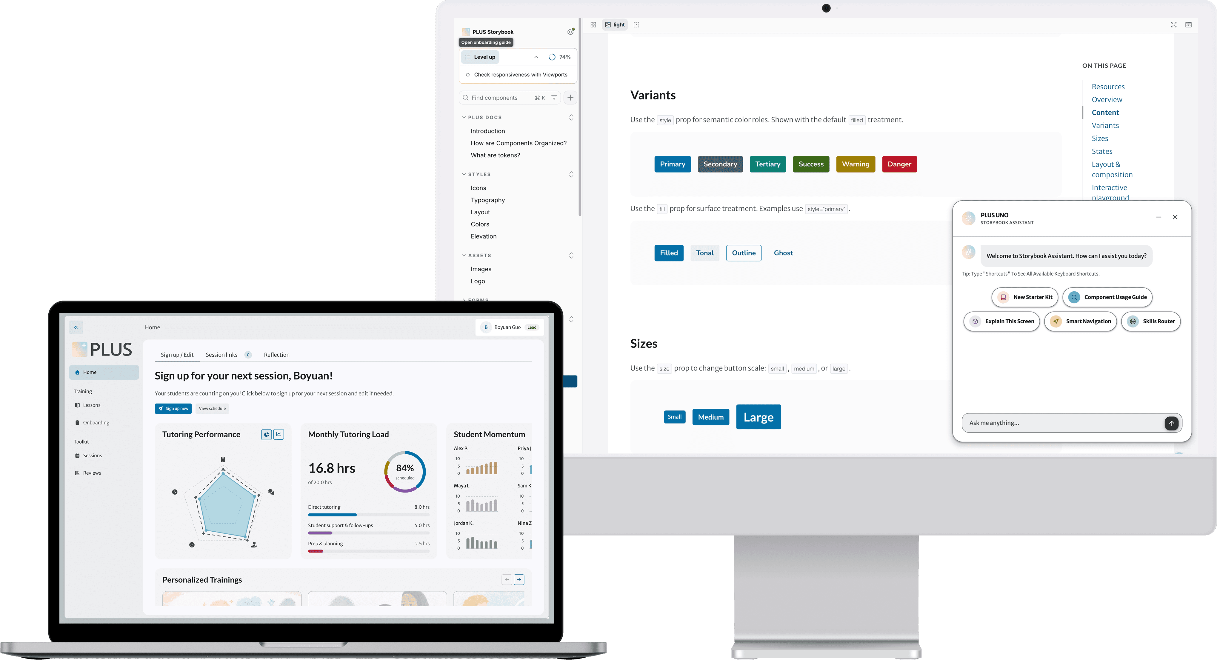
PLUS Design System
Leading and managing the revamp of the PLUS Design System to improve design consistency and make the system easier for designers to understand and use.
CONTEXT
PLUS already had an established design system supporting a growing product and design team. But as new components, patterns, and product requirements accumulated, the system became harder to maintain and use consistently.
Similar decisions were being expressed in different ways, and designers increasingly relied on prior system knowledge to understand which rules to follow.

OUTCOME
01 Semantic Foundations
Problem
The design system was mid-migration after a handoff, leaving its spacing system incomplete and dependent on legacy tokens. The goal was to finalize the semantic token architecture and migrate all components to a consistent system.
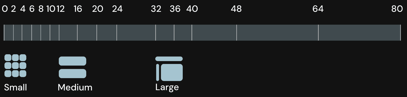
Initially, components relied only on primitive 4px spacing tokens, with no semantic layer. This removed contextual meaning and led to inconsistent spacing decisions, especially during handoff.
Solution
I finalized the semantic token set, led element and modal spacing definitions, and migrated atoms and molecules to the new system with clear usage guidelines.
Primitive VS. Semantic Tokens


Primitive VS. Semantic Tokens

02 Refactoring & Migration
Problem
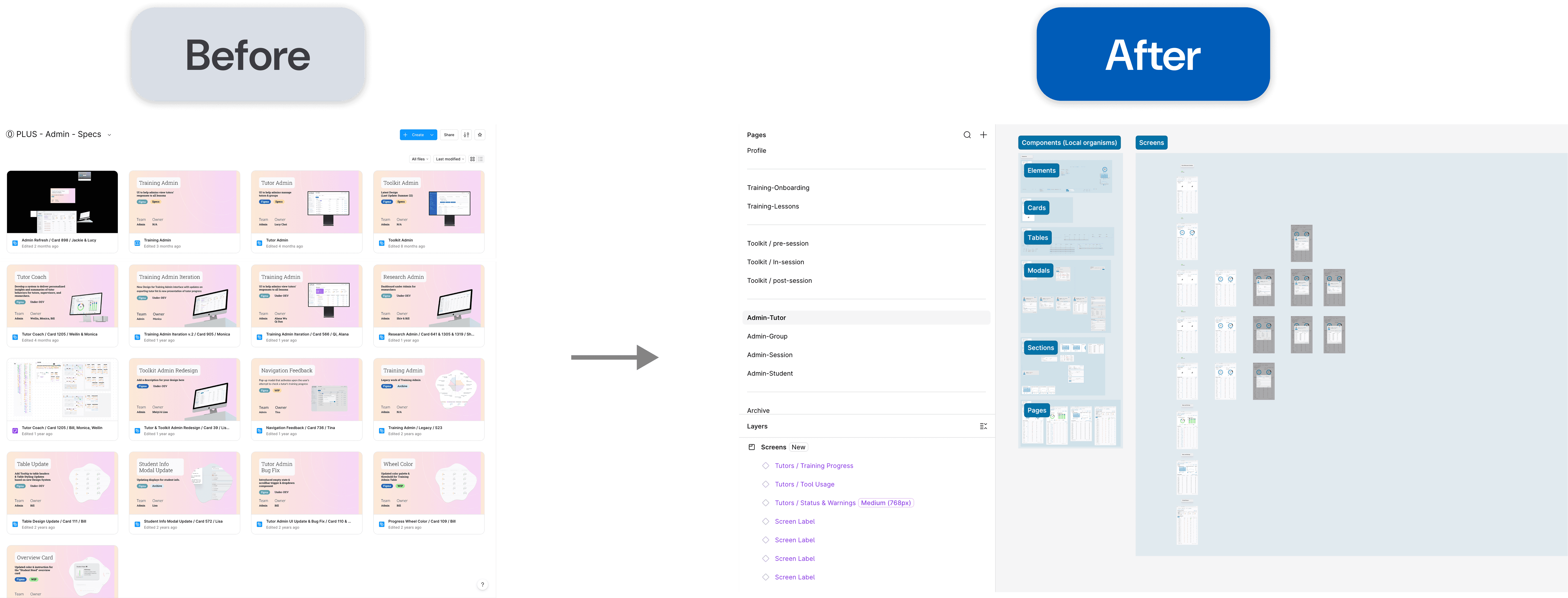
Design specs were fragmented across team folders, creating inconsistent documentation and a lack of a single source of truth. The goal was to consolidate them into one project and update all specs to the latest design system standards.
Solution
Spec Organization Method
Components - Elements, Modals, Pages, etc
Screens - Information Architecture and User Flows
03 Unified Componrnt Sizing System
Problem
Solution
I established a clear and unified size system for all atomic and molecular components, reviewed organisms to ensure the updates remained consistent across higher-level patterns.
Component Sizing Documentation